
Terms such as "fine" and "medium" have never been strictly or uniformly defined, with each manufacturer using its own sizing standard. Most nib units were not marked as to grade prior to the 1960s (though there were exceptions going back to the dip pen era). Where such marks are present, they will be noted in our catalog description -- though in some instances our own nib grading scale (which is based on actual test writing, rather than just measuring the tip) may not be in complete agreement.
We use the following descriptive terms, listed in order of increasing width: needlepoint; extra-fine; fine; medium; broad; extra-broad. As a general rule of thumb, we take a line width of 0.5-0.7mm to define the border between fine and medium. We will sometimes use split grades, such as "medium fine" or "medium broad", to more accurately describe borderline cases. Terms for other nib features and qualities are explained below.
| semiflex | = | relatively little line variation writing lightly; in some cases, may behave as a flex with heavier pressure | |
| flex | = | significant line width variation with light to moderate pressure; almost no modern "flex" nibs are this flexible | |
| superflex | = | large line width variation with very light pressure | |
| firm or rigid | = | no flexibility to speak of; "manifold" is a synonym denoting intended use with carbon paper | |
| italic | = | chisel-cut, giving thin cross-strokes and thicker downstrokes | |
| stub | = | chisel-cut like an italic, but more rounded, easier for general use | |
| oblique | = | like an italic or stub, but cut at an angle, sloping back to the left when viewed from above | |
| reverse oblique | = | as above, but sloping back to the right when viewed from above |
Writing samples are provided for nearly all of the pens listed in our catalog. If a pen of interest lacks a sample, please let us know so we can provide one.
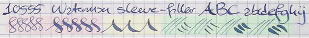
Our basic writing sample format is illustrated above. The top line is written at normal correspondence speed and pressure, with no special effort at calligraphic effects. The figure-8s, shaded in pink, are done first with no pressure, then more slowly with flex on the downstrokes. The up-and-downs, shaded in yellow, also demonstrate opening under pressure on downstrokes. Finally, the alternating cross-strokes and downstrokes, shaded in green, are done first without pressure and then with. Some pen sellers exaggerate the flexibility of their nibs by pushing them to their absolute limits. We do not do this: our samples are done using a light and careful hand, to give a realistic picture of each nib's range for safe and sustainable use. Our samples are usually written with Parker Quink or Pelikan 4001 on Rhodia paper, ruled with a 5mm graph pattern. In some cases this ink and paper combination will display feathering when very flexible nibs are at maximum width and wetness, so samples with less absorbent paper and/or thicker ink may be provided as well.
In some cases you may see significant line width variation in a writing sample even though the nib isn't described as flexible or as an italic, stub, or oblique. This is typically due to the shaping of older tips: whereas nearly all modern nibs have spherical tips, older nibs had tips that were more oblong -- sometimes to such a degree that we will describe a nib as "semistub".
Back to Catalog Table of Contents